söderström
Four new prints by Bo Söderström are now available at ed-art.se. The pictures carry Söderström’s usual simple titles - on-purple, on-black, red-red+red and blue-blue+blue. As simple and clear as the images themselves. For Söderström’s modus operandi is that of reduction.
When this "little" remains, what is it that after all makes the images interesting? In a review of an early Söderström exhibition, art critic Arne Törnqvist wrote: "What is the secret behind Söderström’s strong expression? One explanation may be that his reduction is just that – a reduction. He does not begin in abstraction and emptiness, but in something both real and complex that he breaks down into its constituent parts. Therefore, the reduction is not as in so many other cases, a shortcut that you take because the study of real life is too complicated and tiresome. The final stage of the process is weightless and energetic as a volatile essence. But it has been distilled by hard labour from a from a solid substance. Bo Söderström seeks the sufficient and necessary. And in many cases, I have a strong feeling that he has found it."
Writer and art critic Thomas Millroth picks up this quote in a recently published text about Bo Söderström's oeuvre. He writes that when Söderström divide his images into blocks, not only gaps appear, but the large fields of colour gravitate towards each other; ”they want to behave like the entire surfaces". "Thus the surfaces move towards and away from each other, but they are not intertwined, since the artist relies entirely on the attractiveness of the colours. Their mood."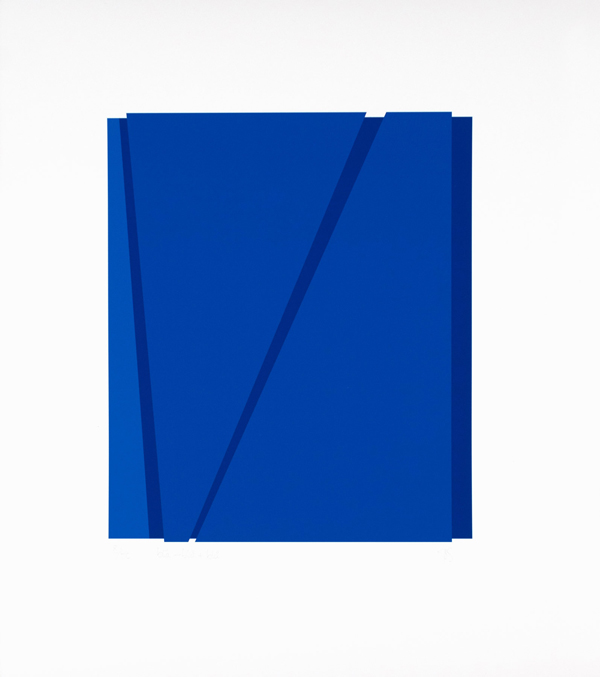
blå-blå+blå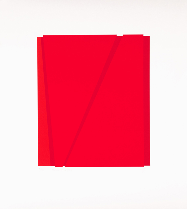
röd-röd+röd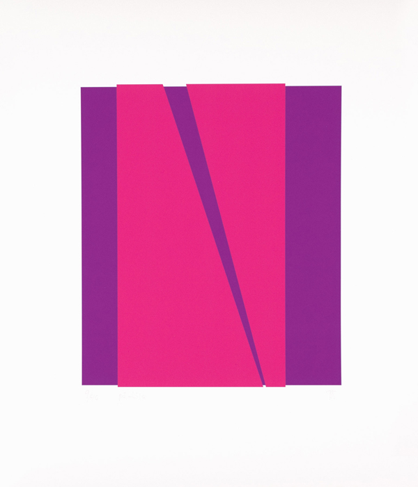
på-lila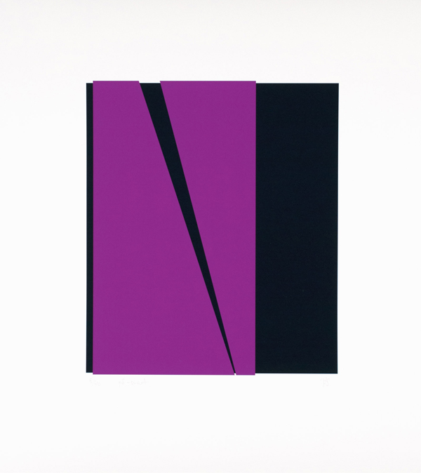
på-svart