setting types

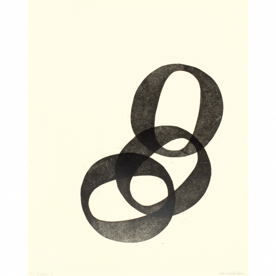
We are pleased to present new prints by Lina Nordenström, alongside her existing artworks at ed-art.se. Letterpress printing has been Lina Nordenström's focus for the past ten years. Despite its name, it is not necessarily about printing books, or letters. It is simply a printing process, which opens up a wide range of possibilities, both in terms of text and image.
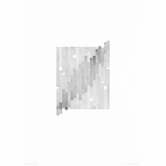
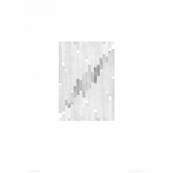
Nordenström's starting point in recent times has been hand-setting, starting from the studio type collection – fonts, signs and lines in wood, lead and brass – which are available in the letterpress workshop in Uttersberg, Västmanland, which she runs together with her husband, artist Lars Nyberg.
- Using only the type available in the studio provides a natural aesthetic limitation and thus a challenge. It is also an obvious reference to the history of the graphic industry, which is also a history of the development of our society, from a democratic perspective – freedom of speech and publication – which I find interesting, says Lina Nordenström.
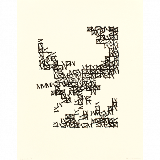
The work with hand-setting is based on the reuse of actual letters and shapes, which have lived their lives for decades at various printshops.
- I do not create my own type, I only use what already exists, in the same way as we do when we express ourselves in writing: 29 letters are all we need. We do not have to invent new letters to be able to express ourselves.
Composing sentences, with the letterpress workshop's collection as a starting point, requires a system that also enables an almost mathematical accuracy.
- At the same time, there is a random factor in the game, not least due to the different degrees of wear and tear of the types and matrices. Pressure and quantity of ink must be calibrated exactly as only a minimal adjustment can impact on the result. I gradually get to know my materials through this working process and this, I find a visual expression, which feels exciting.
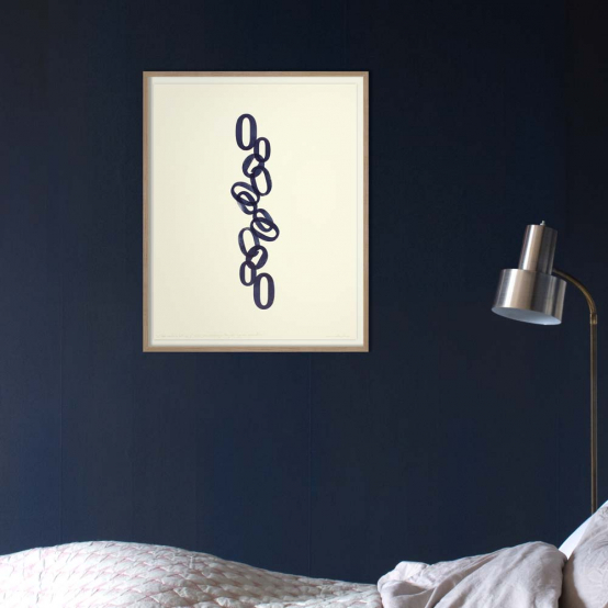
For Lina Nordenström, the balance between a readable and an abstract expression is an interesting challenge:
- Sometimes the typographic forms get a life of their own. Other times it is the text that dominates, the readable meaning.
See all of Lina Nordenström's works here